Visualization Work for the Projected Growth of 20 Hybrid Jobs
Published:
I optimize the visualization on projected growth of 20 hybrid jobs (oringinal source)
Problem analysis
This oringinal visualization presents the projected growth for the top 20 US hybrid jobs. Each hybrid job has three different variables, including the percentage of projected growth, salary, and the number of job postings in 2016. We can see the visualization is problematic for the following reasons:
- It’s not easy to identify the difference of circle size, especially when numbers of postings are quite close to each other. In the visualization, the circle sizes for web developer and java developer look same. These two hybrid jobs have the same projected growth; however, the average salary of java developer is higher than the one of web developer. In this situation, the exact number of job postings can help better know the demands of the job position.
- Some hybrid job cannot show up, since the circle size is too small. For example, biostatistics manager is a well-paying job that has high projected growth, however, there were very few postings for the role in 2016.
- Some of the jobs have long full name. In the visualization, it’s not easy to identify which circle belong to which job immediately. For example, the circles of senior data scientist and big data architect are at the right bottom of the visualization and close to each other. It’s hard to distinguish which circles they belong to separately.
- Some circles have overlapping area, which make people question if there are any cross positions. For example, the embedded software engineer is pointed to the overlapping area.
Improvement suggestion
The visualization can be improved in two different ways. One way is to make a grouped bar chart. The other way is to use color map to indicate the number of postings for each job. The detailed explanations are given below.
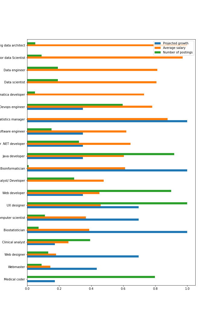
- Make a grouped bar chart (refers to Figure 1)
Since the three variables have quite different numerical scope, to better visualize in a grouped bar chart, we can normalize these three variables into [0, 1] scope, separately. We can use three different colors, including blue, orange, and green, to represent these three variables, as shown in Figure 1. 
Figure 1.
- Use color map (refers to Figure 2)
In the original visualization, we can see that some circles overlapped together. To solve this problem, I suggest changing the x axis and y axis to number of postings and average salary, respectively. Colormap Viridis is applied to indicate the projected growth, as shown in Figure 2. 
Figure 2.
